BEING THE CLIENT
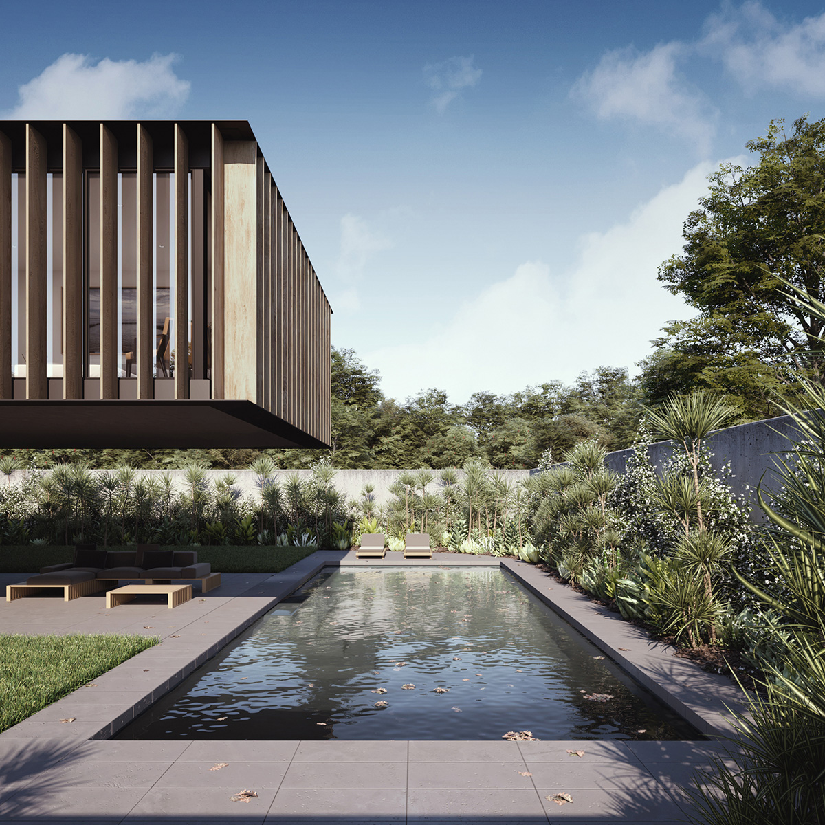
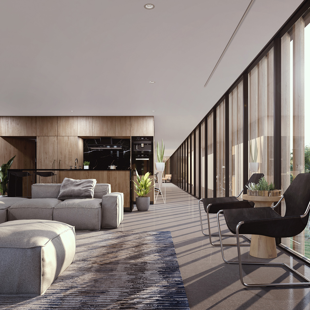
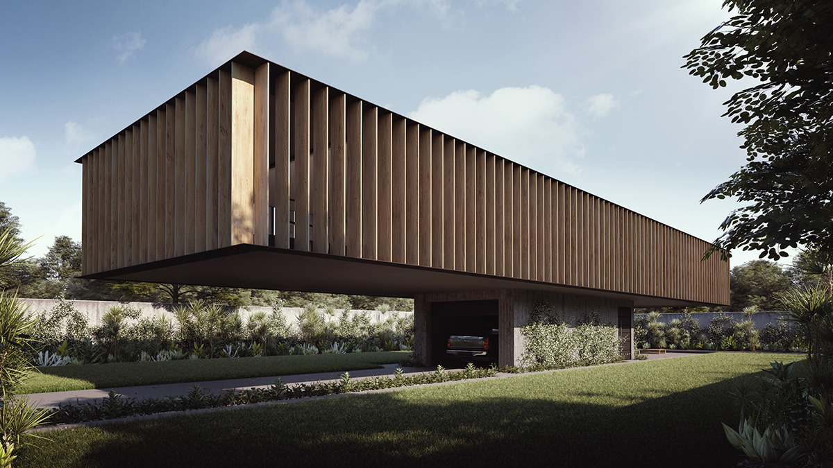
This idea for ‘Pedestal’ had been playing on my mind for a long time. I was intrigued by the idea of a house that maximises yard space by elevating the structure above. The living spaces would enjoy a better outlook, and the kids could enjoy more space to play.
I also wanted to push myself with a personal project at home, see if I could really bring a whole concept to life again. It had been a couple years since I tried. In the years leading up to this point I ran an Arch Viz studio. My time was evenly divided between managing and directing people, and being worried about the numbers. I wanted to find the joy again of bringing ideas to life, away from the deadlines and get back to what I love so much.
It’s the reason why I am an Arch Viz Artist. I get to work on so many different projects and I love that variation and expression. I enjoy bringing others amazing ideas to life and when possible, sometimes my own.
In recent times that’s what I am focused on, pushing myself in new areas to develop skills in concept design. So I’m back doing what I love and growing as an artist again. However, starting from scratch with an empty screen is daunting, it seems impossible.
One of the things that helped me tremendously was to build a story first to help define and impose some imaginary constraints. While I started with an elevated house, I then drew inspiration from the zombie genre as there’s so much reference available. I thought how can I make this a zombie proof house?
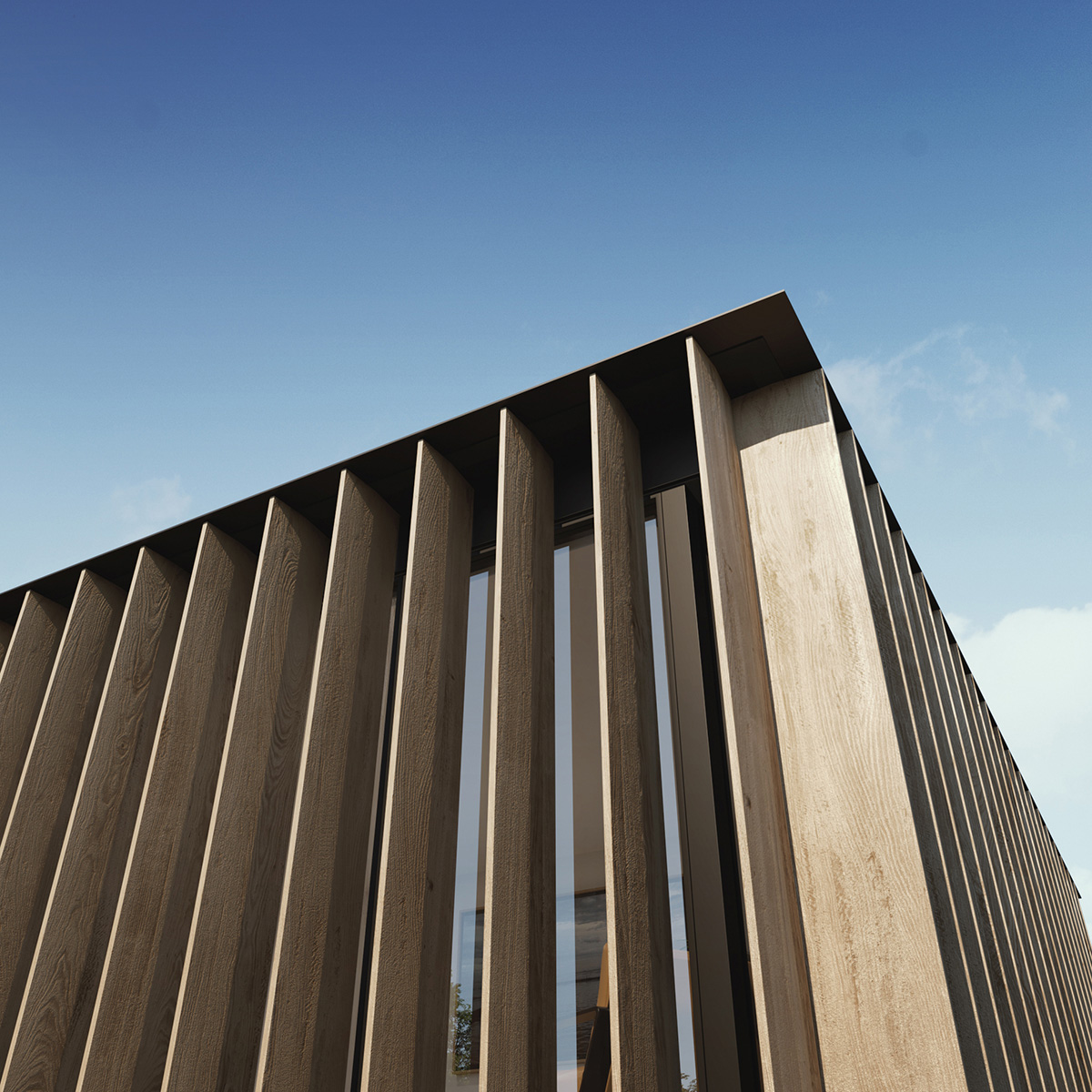
I had fun with this idea. It allowed me to fill out some of the detail I didn’t have from a client brief. I imagined the first floor would be raised. The exterior would be secured by rotating louvres, following the sun each day letting natural light in, then closed shut each night, only to reset each morning when the world was safe again. I know this sounds ridiculous, but it made making it up fun and I thought why not? Anything to help drive progress.
Without other constraints I had to start somewhere. So, with an idea in place, I decided on a less than obvious place to start and imported a car. Not just any car either. In keeping with the fiction theme and a recent screening of Back to the Future, I imported the closest thing I had to a 4×4, just like Marty McFly found in his garage. Why? Because I can. It’s my house and that’s the car I most wanted when growing up. Plus, it’s the perfect choice for ransacking the surrounding neighbourhood during the day…just in case there’s a zombie apocalypse.
Moving on from the nostalgia, I then started modelling around it. First the garage, then the entry stairs beyond and built the pedestal. From there I modelled the first floor slab and roughed out the internal walls.
I was still making it up at this point with no offsets to work backwards from. So I went through and dropped in basic furniture as massing to help me define the required space and ultimately lock down how big the slab needed to be.
Now, at this point most of you are thinking, is that slab and cantilever even possible? Well the short answer is, probably, but it doesn’t matter. While I may have started my career in Civil Engineering, I am now well and truly an Artist and in this case am able to take artistic license where I choose. It’s liberating and would encourage you to push your own artistic limits in order to achieve more personal work also.
With my structure as defined as it needed to be, I finished modelling and applied materials. I always use 3D Studio Max and Vray, so the process is very straight forward. I then laid out the cameras as I had imagined. While there could have been more or less shots, I wanted to try and capture the whole house and the key features as best I could.
Laying out the cameras also helps define the scope. It’s important to try and measure out the total work required so you can work to a schedule if possible. Any artist can work on an image forever because art is never done, but you have to draw the line somewhere. I try and be as commercially viable in my work and keep to a sustainable schedule, even for personal work.
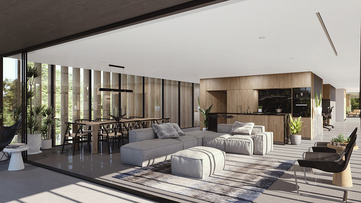
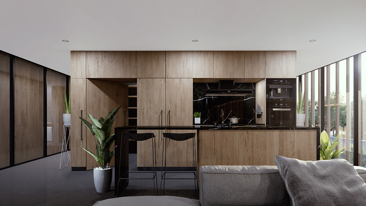
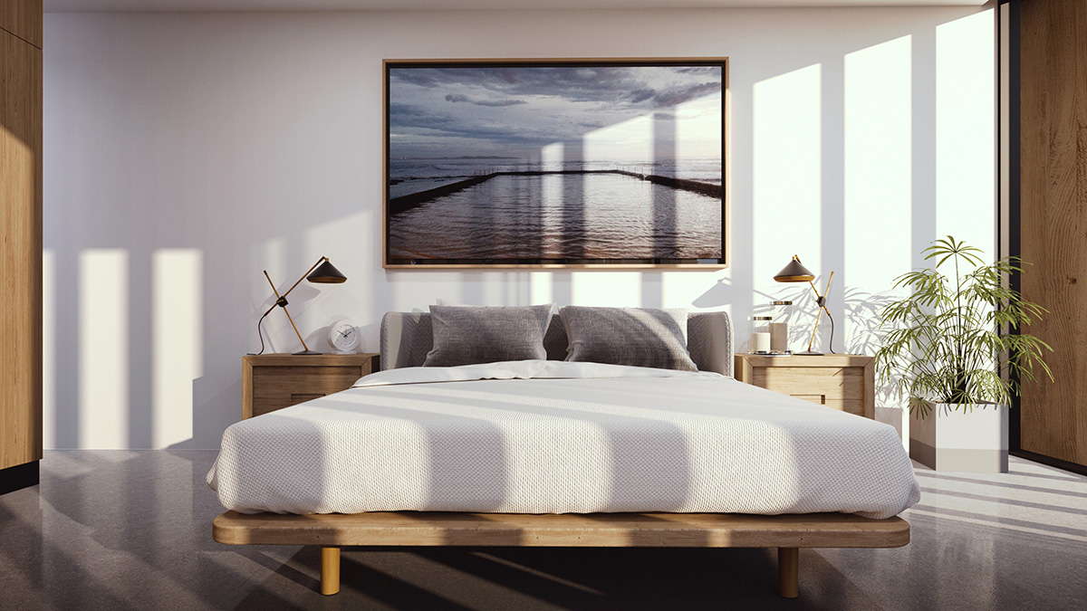
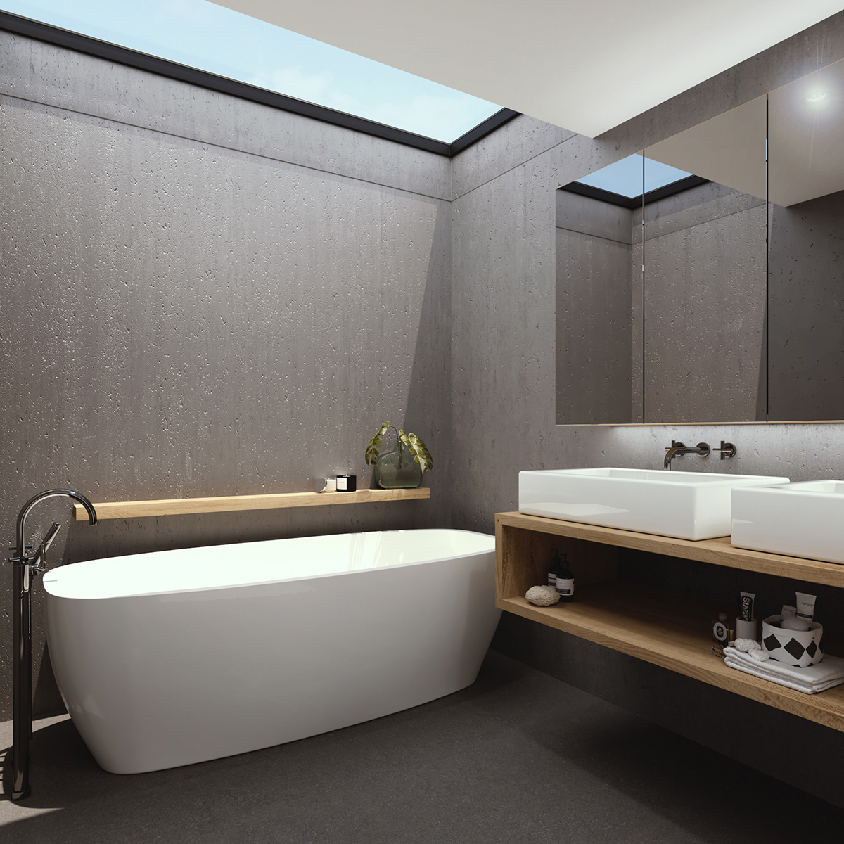
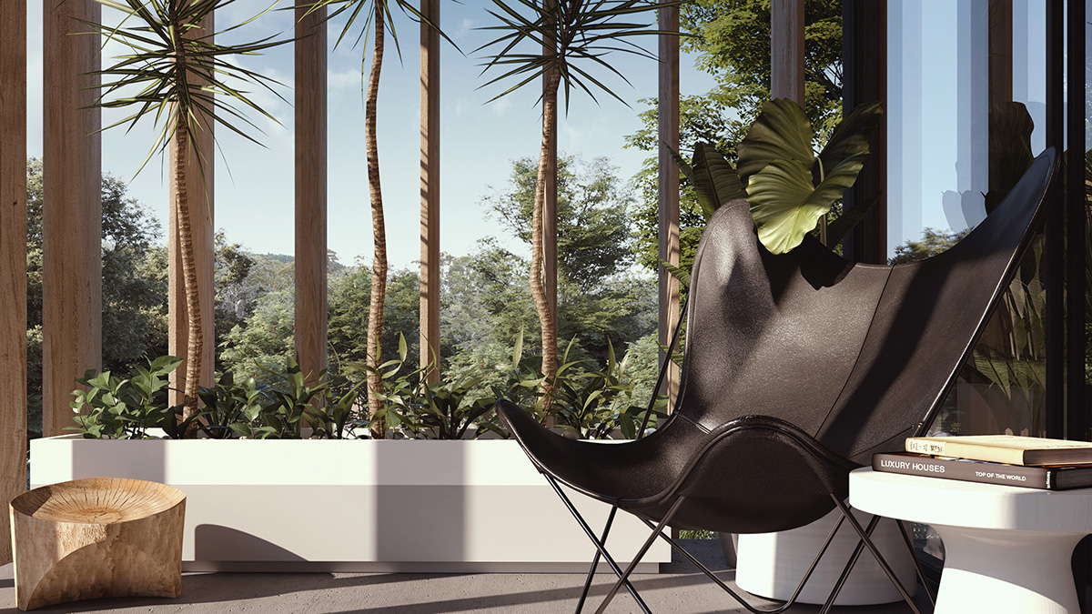
The house itself is quite simple, and the styling not too over the top. I used objects from my library, but also some from DesignConnected and Turbosquid to add detail. Part of my idea was to make the house look empty and abandoned, like as a family we had to leave once the food ran out, leaving a beautiful house forever.
To be honest I don’t think I achieved this. It became clear during the styling process that I would need to over-emphasize this point and really exaggerate the neglect. The result would have been abandoned images with a clear story, but not renders that I might be able to use for my own marketing purposes. So in the end I had to compromise. The final result is non specific and I am okay with that.
As all renders should be, I lit each shot individually. I also used ForestPro for the lawn and leaves, plus a handful of Vray Proxy Trees where required. I rendered each shot and applied a couple of things of post, such as sky replacement or slight additions and adjustments, but not a huge amount. I try and do as much work as possible in 3D with minimal post. I find that when doing a range of shots, it is better to build as much as possible in 3D with alternate lighting setups, that way changes are consistent. If I was doing a single shot, you could probably do a lot more in post and save some time.
The goal of this exercise was to enjoy my work and to push my skills in concept design. I am not sure I quite hit the mark on the story telling. But the idea kept me motivated and what’s equally important is to get the work done and move on. Where I failed in this project sets up the lesson for the next.
The goal was to realise an idea and in Being the Client for myself. This project brought me a lot of joy in the making and I hope that this post might inspire someone else. It’s not perfect, it’s done. There is a lesson in that by itself.
If you have any questions, please feel free to get in touch.
