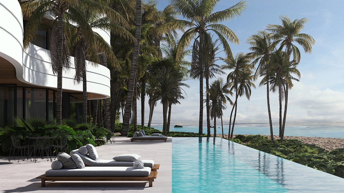
PURPOSE
My purpose as an artist is to bring the unbuilt form to life in a realistic and evocative way such that my clients and their stakeholders can engage with the process of design and development. With 20 years of experience in this field, I have delivered hundreds of projects in the form of thousands of images and animations to the highest level, achieving design outcomes and sales targets that many did not think possible.
I am here to help my clients realise the potential of their projects, combining our skill sets to achieve the right results. It’s about more collaboration, less revision and higher gross realisation. In the following case study I will discuss and highlight some of the considerations in what makes great art and what should be part of every projects strategy whether pitch, presentation or marketing off the plan.
STORY
For over a year our lives have been turned upside down and life changed beyond measure. We have had to adapt to new ways of working, managing in remote ways, employing next gen technology to help rapid prototype ideas, and getting things done despite the isolation, and at times, hardship. My concept design is called Halcyon.
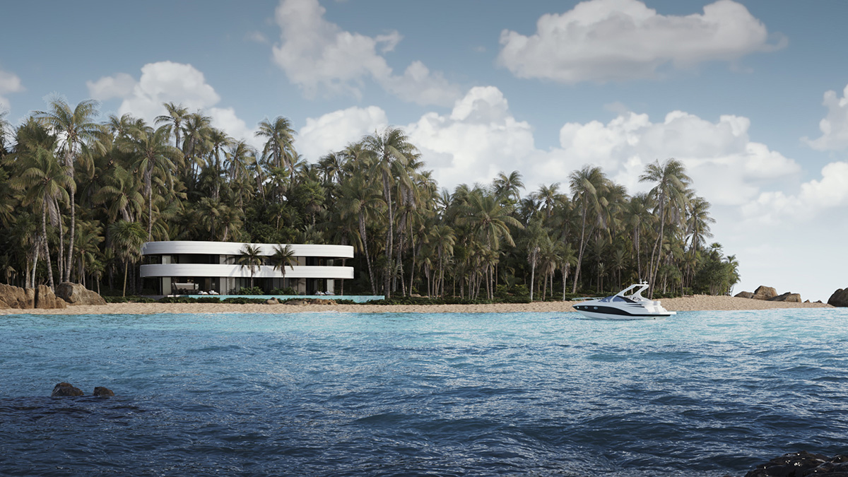
During these difficult months, I developed this idea of a dream house where I could work in isolation remotely, inspired by the absence of my favourite TV show, Survivor. Capturing the blue green waters of Fiji I have been missing, this house pays homage to a sleek and modern horizontal facade that juxtaposes against the vertical green wall of a dense tropical forest. It is a luxurious parallel to the hand made shelters of Survivor, but in these tough times we all need to find a way to outwit, outplay and outlast the competition. I had to get this idea out of my head. It was truly a matter of surviving my inspiration and thriving during challenging times. From hand sketches and reference images, to a suite of beautiful renders, my concept is here to share and I hope inspire my clients to share their own by letting me help them bring their ideas to life as well.
CONTEXT
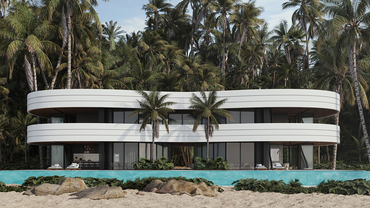
When developing a render, and of course the architecture itself, it is important to consider the surroundings of the site and settle the built form into the environment. In some cases we use Photomontages to submit to Council for approval, which gives a more photorealistic impression of the potential project, but in many cases does not show the finished product in the most ideal light. Odd angles, fixed lighting and undesirable context often leads to images that are fit for approval purposes only. Hence why marketing level renders are almost always built in full 3D, allowing adjacent context to be lit and detailed as beautifully as the subject site so the image overall behaves in unison.
Whenever possible I try to model as much surrounds in 3D as possible. In this case I have gone to great lengths to build an island context that is lit and rendered naturally alongside the concept itself. It means I can deliver an unlimited number of rendered angles with the planting and landscaping in place, allowing each view to be as settled and realistic as possible, at any time I choose. It’s worth the investment.
MATERIALS
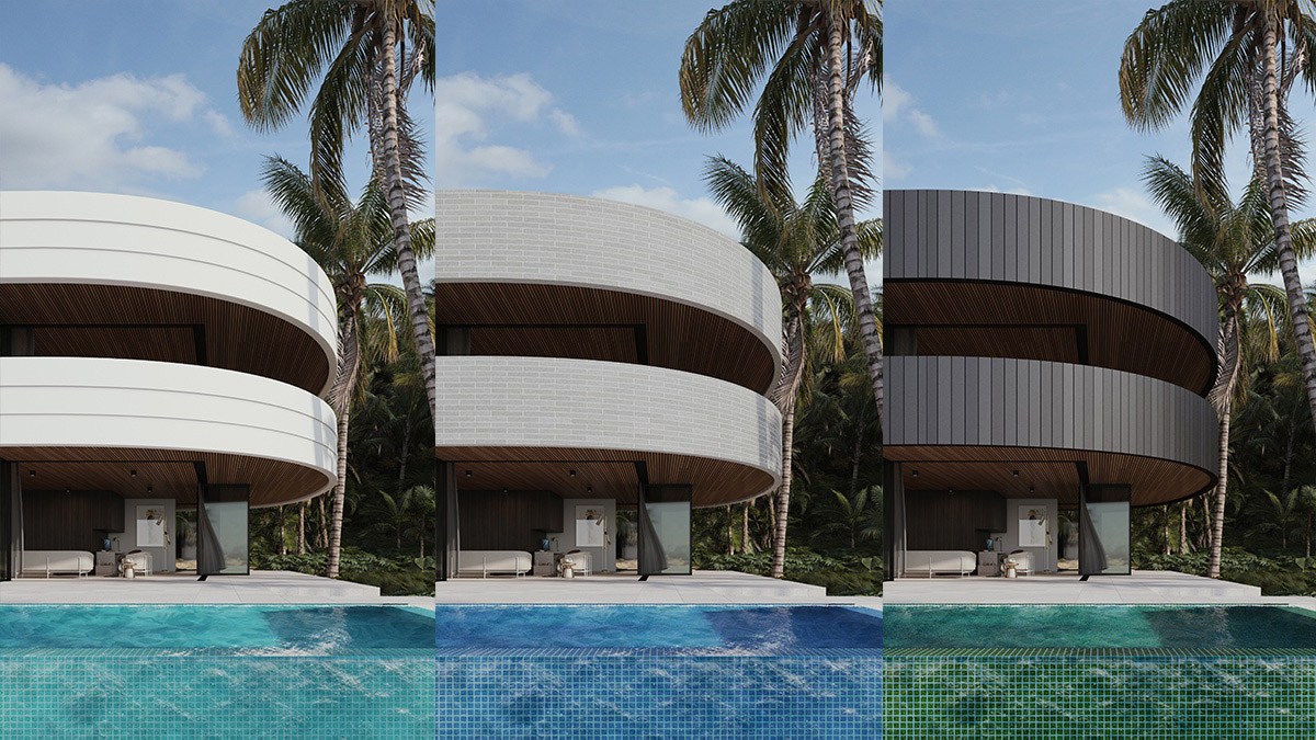
When marketing a property, most of the decisions have been made, but by engaging an artist in the design development process earlier on, you can very easily use artwork to help minimize uncertainty by seeing design options in context. Different materials behave different under different light, and by comparing those options side by side, you more readily engage the stakeholders and lock down agreement. Once modelled properly, it is extremely cost effective to add alternate schemes and test them visually, particularly when comparing complementary material elements as shown.
By holding some aspects of an image constant, and organizing the file properly, an artist can very swiftly be of use when making these kinds of decisions, particularly in the early stages of a concept. Markets move, sentiment shifts, trends change and as an artist the way I work allows for flexibility because I want to be part of the process. We can spend time on this and get the right results because 3D technology has advanced and is now available to my clients.
SPACE
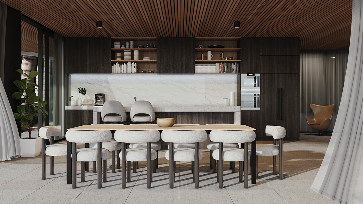
Architecture can be as much about the space it activates as the form it takes. While some buildings can be sculptural and important to illustrate, it can be just as salient to show connection between space internally and how the client or buyer will engage with the design itself. Rather than limiting ourselves to just a kitchen, or just a dining area, below we look at how those two zones relate to one another and how it might be experienced when standing on the open deck or entertaining area.
In this case we don’t want to overdo the styling and embellishments to clutter the scene too much, and we use a simple single point perspective to keep the lines clean. The time of day is chosen to allow natural light to fill the space and also the shadows to play a role in breaking up flat surfaces and areas. The image tells a story about this space rather than illustrating a single design feature. What I want the audience to see is the space and the connection rather than focusing on the specifics of a scene.
FINISHES
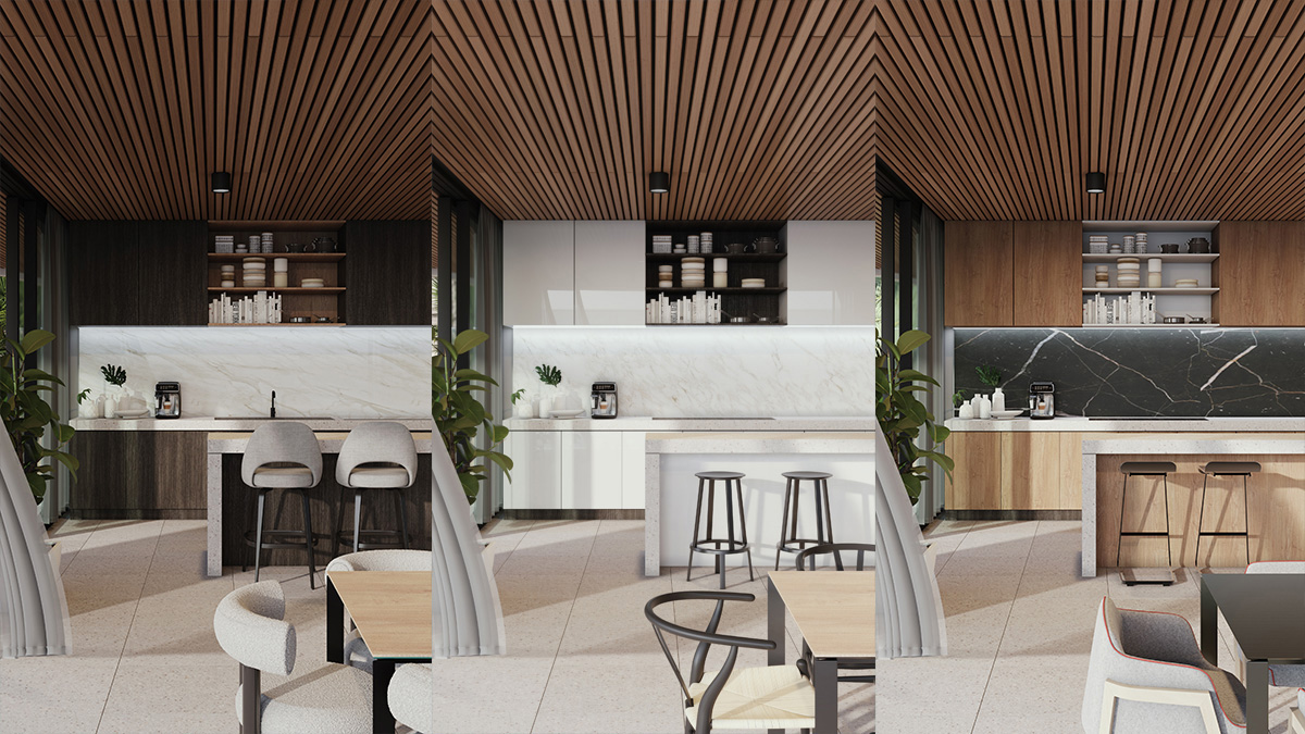
As with exterior materials, interior finishes are just as, if not more important to higher density living where the buyer is most interested in what’s inside the living envelope. In many cases a developer will be offering multiple finishes schemes to potential off the plan purchasers, so accuracy is important. Setting up alternate schemes is not a huge undertaking if modelled in 3D to start, and with the right file organisation, multiple variations can be delivered. In those cases it may also be prudent to change the furniture in the shot to align more with the style of the finishes.
Personally, while developing a concept I will have a strong idea of what the key design will be, but I will often use my renders to help inform the result by challenging my own assumptions. At the speed we can now render, using state of the art CPU and GPU technology, seeing work in progress renders happens almost instantly. As a result, concept design is iterative and fluid, and I believe helps deliver better design outcomes faster.
MOOD
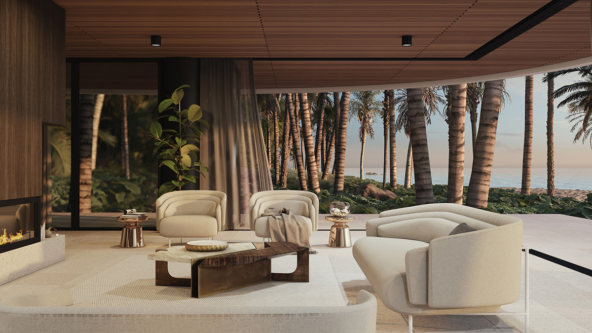
Often when trying to sell a space it’s crucial to convey the livability of a room. This requires the right selection of furniture and embellishments, and a sense of openness and realism that certain times of day enjoy. Rather than a typical photographic exposure where the interior is bright and the exterior is overexposed, I try to balance the render inside and out so the viewer can make a connection between the spaces, in this case the context and horizon, all in one shot. This requires some skill and tricks to make work, but the mood of the shot sells both the design intent and the story we are trying to tell.
Warmer interior lighting balanced with a natural ambient sky and the key light of the sun is required in different measures to bring the tones together in a way that doesn’t wash an image with one colour or another. The effects are subtle and the scene requires some specific tweaking to enable this to all work seamlessly in the final render. The goal is to convince the audience that this would be the real experience standing in this spot, connecting all the elements of the surrounds and design.
STYLING
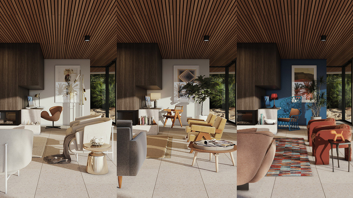
One of the most challenging aspects in delivering great renders is in the choices we make around interior styling. Given almost unlimited choice, interior styling now requires both a well organized process and an extremely flexible approach to getting interiors right for clients. Making good choices comes with years of experience and also a keen grasp of current styles and trends, which is a business in and of itself. My goal is to try and make the process as painless as possible by offering a styling component to my work, or allowing my clients to make their own choices themselves, then be flexible enough to refine swiftly and iteratively.
To achieve a great result, we need to be distinctive in designing the look for the demographic we are targeting and cater to the unique needs of individual clients or buyers. 3D renders not only present an architects or developers design, the artwork also represent the people and companies themselves for many years as a communications device. I want to get the style of our collective work right and am committed to that task as always.
VIEW
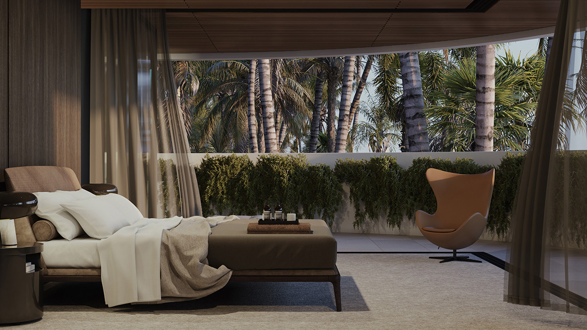
One aspect worthy of deep consideration for any new design is the view. While desirable to have the view photography shot via drone and dropped into our renders, even when this is not possible, it’s still paramount to make the view delight and inspire. When working on high concept work, complete 3D scenes are a great way to develop a context that conveys the surrounds plus the connection the new design makes though the space to the world outside. Using extremely high quality and realistic planting and trees now available, means this can be done where photography cannot. This method offers flexibility in the cameras angles you choose and the lighting conditions you wish to achieve.
I absolutely love environment modelling and try very hard to settle my concepts into an appealing and believable context that allows connection to the design. The resulting files can be very heavy, but investment in cutting edge CPU and GPU technology allows a high degree of flexibility. The right tools really can achieve a fantastic result.
LIGHTING
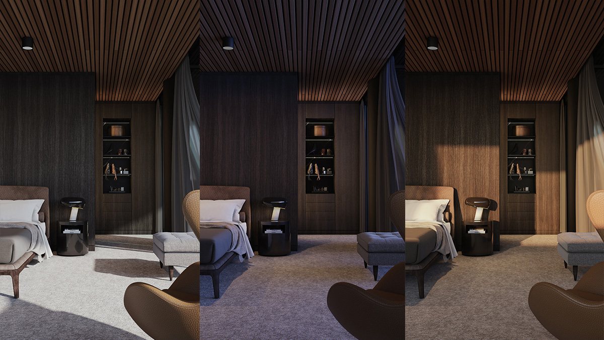
One of the distinct advantages of rendering is the ability to change the time of day and assess different scenes with alternate moods or applications. This is particularly true for rooms or areas whose function and use happens at specific times and you want to understand the experience a person may have in that setting. Not only is it relatively simple to achieve, but extremely helpful to the marketing process if there is discussion around the storytelling element of a campaign. In this example, a bedroom may be rendered during a typical day, but is more likely to be used in the morning or evening, even more importantly, which time you use may be guided by the colour palette or theme of the brand and collateral.
Given the prolific nature of digital delivery now, it is worth considering having these kinds of renders with options so that a client or buyer can swipe between images and interact with the collateral itself. Responsive web browsers allow either slideshows or even swiping effects over images like this to provide another level of storytelling and customisation. My experience working alongside creative agencies has taught me to consider these elements right at the beginning of a process, and build my scenes efficiently to enable delivery of options that build engagement.
FLEXIBILITY
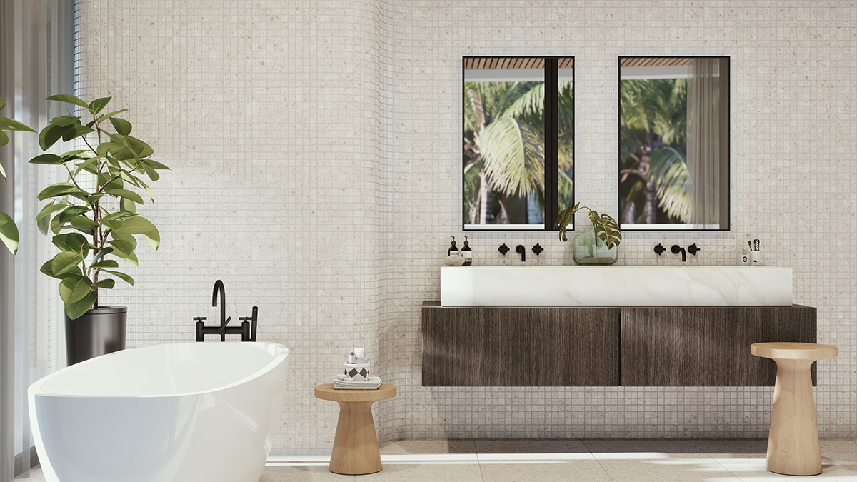
One aspect of rendering that makes it so powerful is the freedom it enjoys. The limitations of a render however, are not always obvious. For instance a render is a virtual camera lens which is limited by the same physical field of view and film gate of a traditional camera. Shooting 3D spaces that are narrow or small is often only achieved by making extremely wide angled cameras which then amount to a great deal of unappealing distortion. The human eye can see a huge field of view, so to give the right impression of a space, you need to be flexible and creative in breaking some rules where necessary.
In the below example to illustrate the design it was best to use a single point perspective, and push the camera way back outside what would traditionally be the fixed glazing. By hiding the facade from the camera, keeping only visible in reflection, we are able to cheat the camera while delivering an elegant image solution. Rendering allows a flexibility that can lead to even better results.
CAMERAS
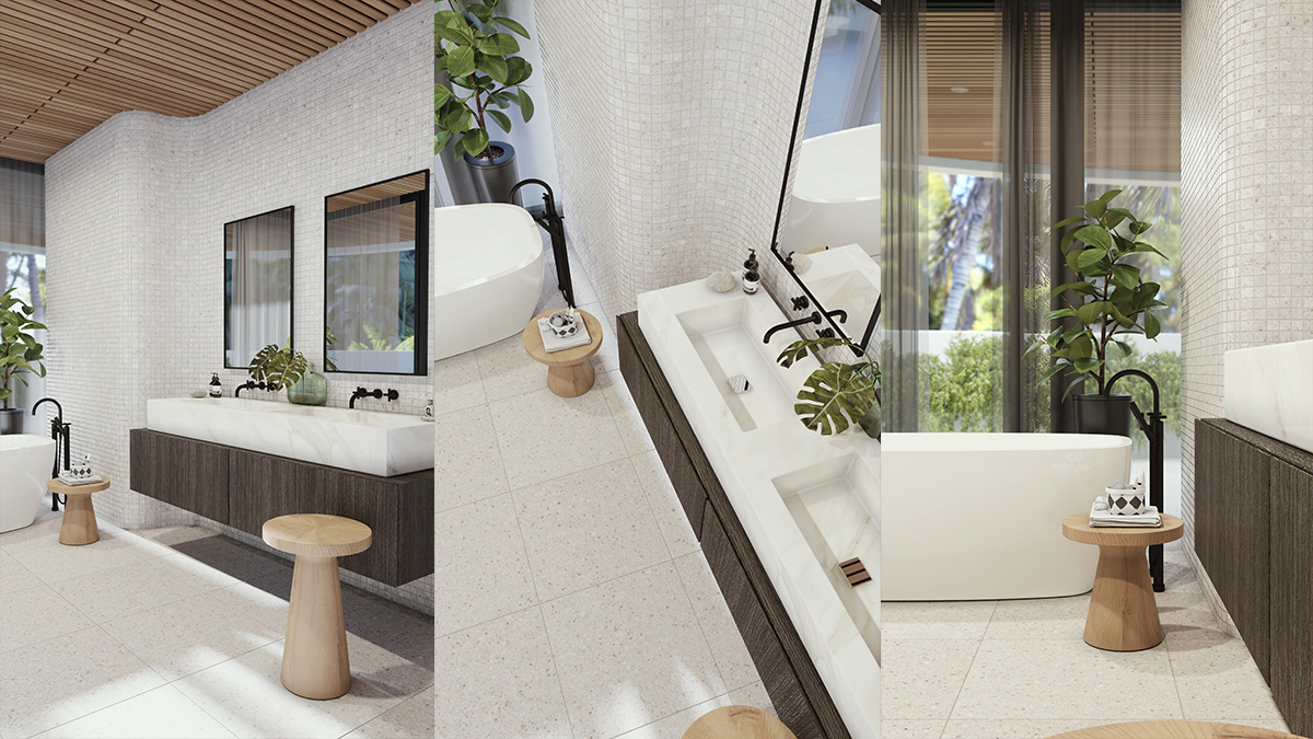
In my experience there are tremendous advantages to rendering early on in the design process as the mind works in pictures. Not only should we be looking at multiple conditions to a scene, but looking at multiple angles for ways to better tell our stories. Sometimes a single image isn’t enough to sell a design or space, so it is far better we explore options as swiftly and efficiently as possible. Presenting both realistic camera angles, alongside more interesting or personal shots allows stakeholders to understand the space and the connections around them.
By communicating and understanding the possibilities that are now available to us via detailed and complete 3D scenes, we can explore these options and open up a dialogue around what’s best for the project. Rather than limiting a brief to a fixed number of images for a fixed price per image, I try my best to quantify a scope and brief that allows for such exploration and discussion so that the best results are achieved. While a stakeholder might think they know what angle to pursue, being flexible in my approach and allowing for options to cameras early on always allows for better outcomes.
CAMEO
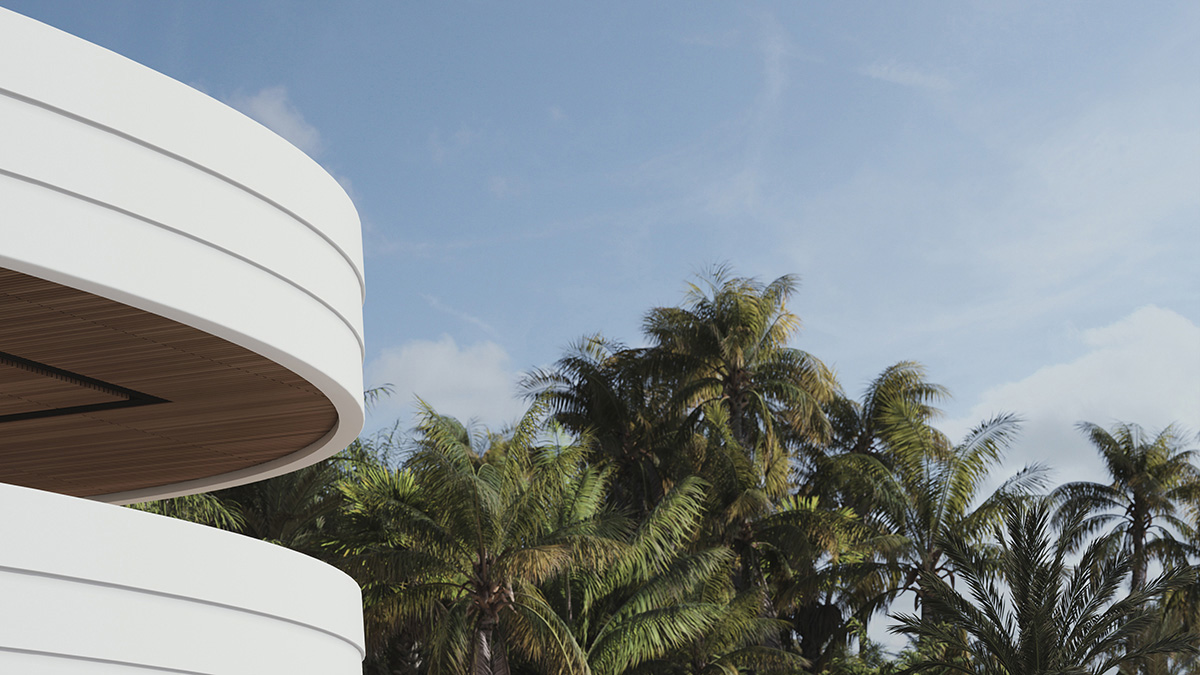
Popularised over recent years, the cameo render is used frequently in marketing campaigns to show only a glimpse of a design, with a view of the surroundings. These kinds of views are extremely popular for multi-apartment towers looking toward sprawling cities or sunsets, though they can also be appealing in smaller concepts with 3D context in place. Why I like these shots is that they can really hero a concept by focusing on the key design element and not crowding the rest of the design by trying to do too much. Again this comes back to flexibility in modelling things in complete 3D, and working in a way that allows exploration and options for your project.
Here I am trying to sell an idea, and it’s done simply and elegantly, rather than being too literal and trying to hero the whole thing. Arguably, when dealing with an active marketing campaign there will be limitations to what realistic photography is possible on site, but it’s important to push those boundaries. We should consider the opportunities to sell a feature by exploring the options, even in concept design.
VIGNETTE
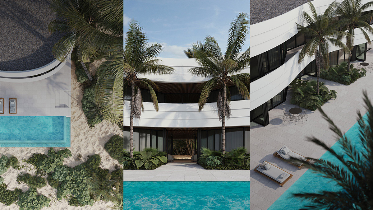
Often referred to as a vignette, exploring options of existing scenes to provide more collateral is important in my opinion. The property marketing world has changed with the rise of social media and the new king in town is engagement. We no longer look at fixed number print runs for brochures and websites, but try to engage global audiences across multiple platforms daily. A marketing campaign, or an architectural design document, can run for a period of years while a project is delivered to market and we need more and more content to be posting on social media to keep potential buyers and clients in the loop and aware of your brand.
When done properly and priced efficiently, a suite of renders can include more than just the basic set of interiors and exteriors that tell a very linear story. Working together collaboratively and wisely, any project can put in place an audience engagement strategy that delivers a range of content for not only traditional collateral but social media platforms over the life of the project. I am an artist. Original authentic content is my passion and I am here to help.